Theming
Both elements draw everything inside their shadow DOM, and read every colour, font and size from
public --scxml-* custom properties. Set them on the elements, or on any ancestor, to make the
elements match your app. Tokens you don't set fall back to the neutral default theme.
The default theme uses system fonts (nothing is downloaded) and one indigo accent. It follows the page's light or dark colour scheme.
| Light | Dark |
|---|---|
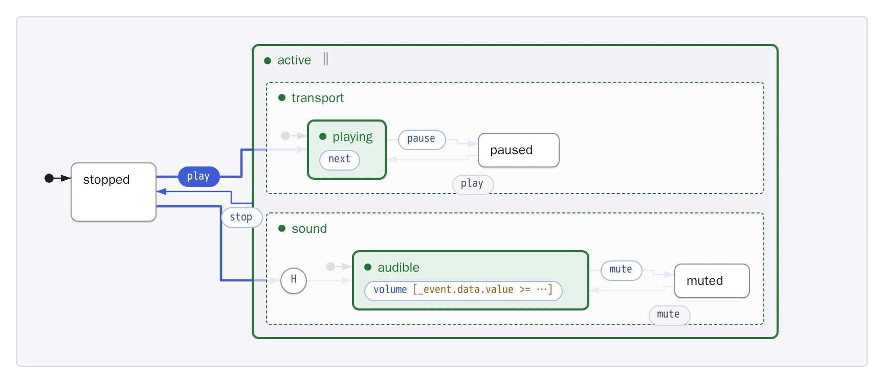 |
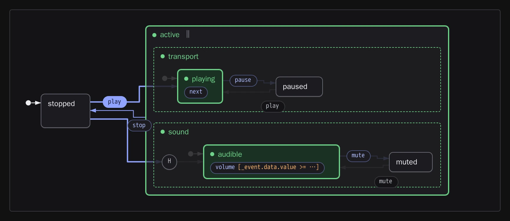 |
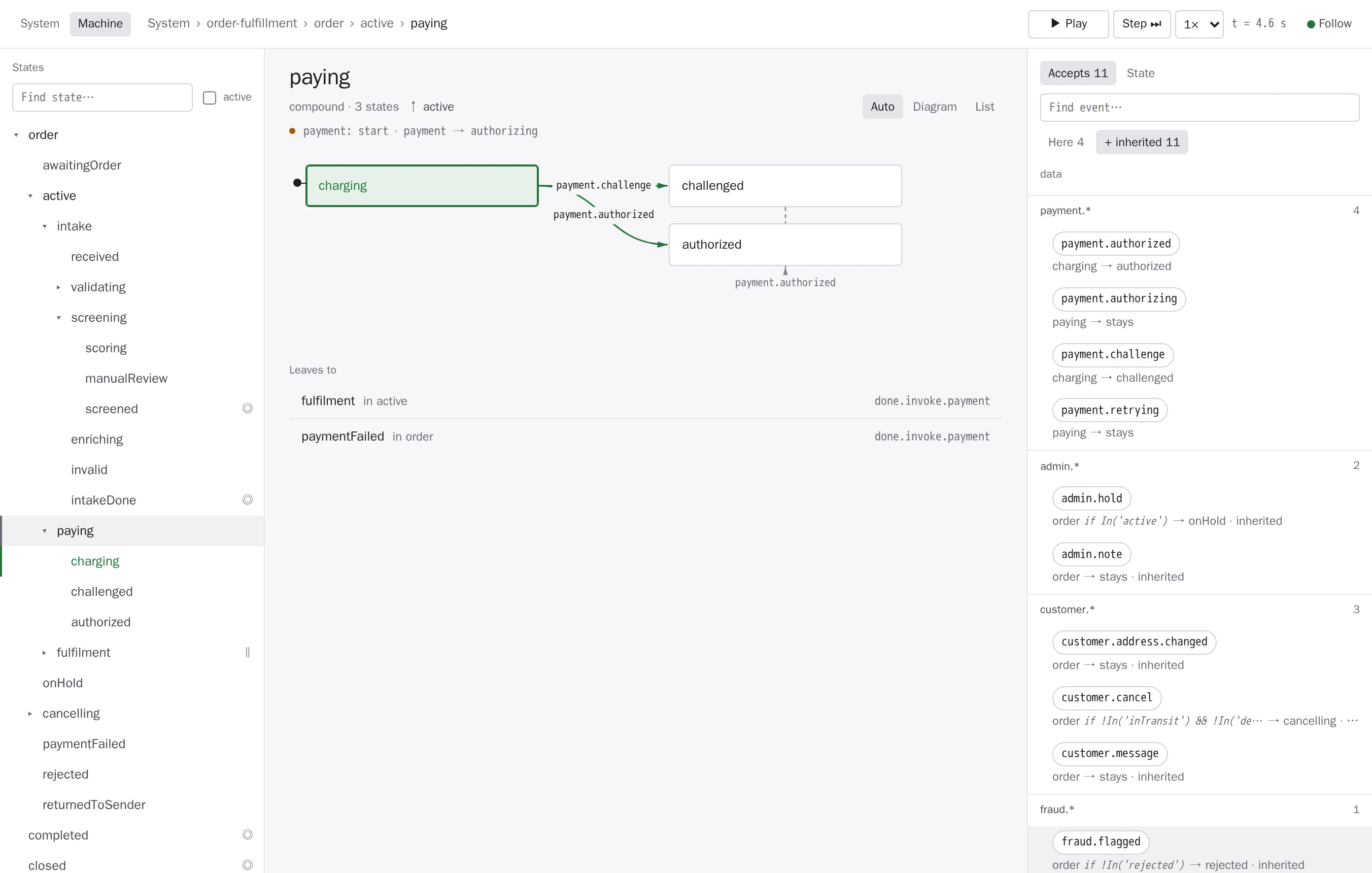 |
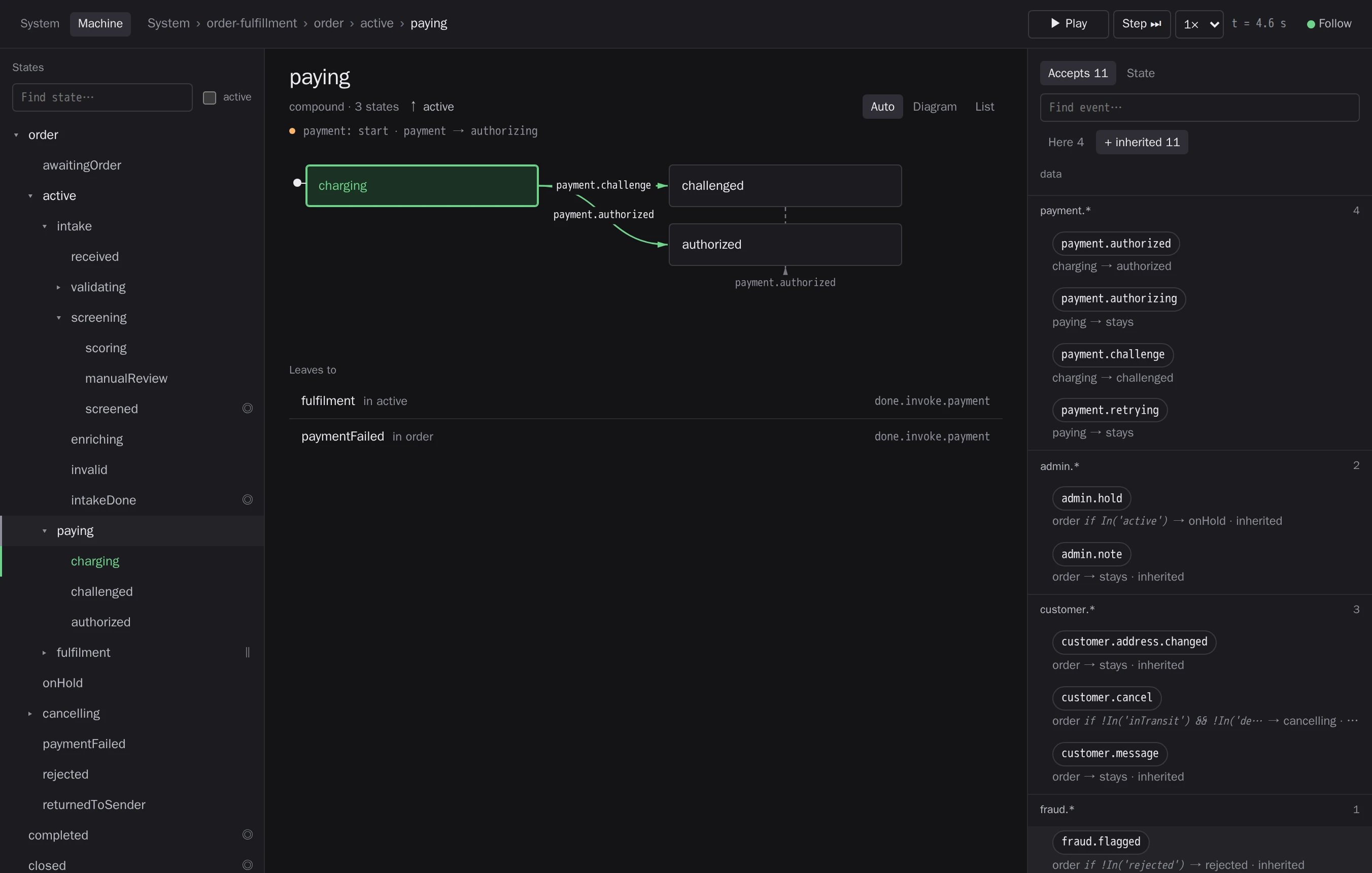 |
Light and dark#
The elements use the page's color-scheme. A page that declares color-scheme: light dark (or
<meta name="color-scheme" content="light dark">) gets the dark theme when the OS is dark;
a page that declares nothing gets the light one. To decide for the elements alone, set
--scxml-color-scheme to light, dark or light dark:
scxml-view, scxml-explorer { --scxml-color-scheme: light dark; } /* follow the OS */Your own token values can use light-dark() too, so one declaration covers both schemes.
Tokens#
The defaults are light / dark.
| Token | Default | For |
|---|---|---|
--scxml-color-scheme |
the page's | light, dark, or light dark |
--scxml-bg |
#f6f6f8 / #141417 |
the element's background |
--scxml-surface |
#ffffff / #1c1c20 |
cards, boxes, buttons |
--scxml-surface-2 |
#f0f0f3 / #242429 |
containers, notices |
--scxml-surface-3 |
#e5e5ea / #2e2e34 |
selected toggles |
--scxml-fg |
#1c1c21 / #ececf1 |
text |
--scxml-fg-muted |
#484852 / #bcbcc6 |
secondary text |
--scxml-fg-subtle |
#6a6a75 / #90909b |
hints, counts |
--scxml-fg-faint |
#85858f / #777781 |
arrows and other graphics (never text) |
--scxml-border |
#e6e6eb / #2a2a30 |
dividers |
--scxml-border-2 |
#d3d3da / #393940 |
control and card borders |
--scxml-border-strong |
#8b8b96 / #6c6c77 |
state boxes |
--scxml-accent |
#3d5bd9 / #8fa3ff |
the accent: focus rings, fired transitions, primary buttons |
--scxml-accent-text |
#2f49b8 / #aebcff |
accent-coloured text (links, sendable events) |
--scxml-accent-subtle |
#e9edfc / #252c4c |
accent backgrounds (hover) |
--scxml-on-accent |
#ffffff / #10132b |
text on --scxml-accent |
--scxml-running, --scxml-running-bg |
#26733a on #e5f3e9 / #6fd48a on #1a3123 |
active states |
--scxml-waiting, --scxml-waiting-bg |
#a8560a on #fdf0e1 / #ffb46b on #382815 |
waiting states, conditions, warnings |
--scxml-done, --scxml-done-bg |
#48566b on #e9edf3 / #a7b5c9 on #242b35 |
final states, finished machines |
--scxml-error |
#c2332f / #ff8a84 |
errors |
--scxml-font-sans |
system-ui, … |
text |
--scxml-font-mono |
ui-monospace, … |
ids, events, code |
--scxml-font-display |
--scxml-font-sans |
titles |
--scxml-display-weight |
600 |
weight of titles |
--scxml-radius |
4px |
corner radius |
--scxml-duration |
140ms |
transitions (none with prefers-reduced-motion) |
--scxml-row-height |
30px |
explorer tree rows |
--scxml-min-scale |
0.65 |
how far <scxml-view> scales a too-wide diagram down before it scrolls instead (1: never; the fit attribute ignores it) |
--scxml-height |
view: none; explorer: min(860px, 100dvh - 32px) |
the element's height (the view scrolls inside it) |
The elements don't load fonts. If a token names a web font, load it in your page.
Keep it readable#
The default theme meets WCAG AA. A theme should keep these pairs at the given contrast ratio; text needs 4.5:1, graphics 3:1:
| Foreground | On | Ratio |
|---|---|---|
--scxml-fg |
--scxml-bg, --scxml-surface |
4.5 |
--scxml-fg-muted |
--scxml-surface, --scxml-surface-2 |
4.5 |
--scxml-fg-subtle |
--scxml-bg, --scxml-surface, --scxml-surface-2 |
4.5 |
--scxml-accent-text |
--scxml-bg, --scxml-surface, --scxml-accent-subtle |
4.5 |
--scxml-on-accent |
--scxml-accent |
4.5 |
--scxml-running |
--scxml-bg, --scxml-surface, --scxml-running-bg |
4.5 |
--scxml-waiting |
--scxml-surface, --scxml-waiting-bg |
4.5 |
--scxml-done |
--scxml-done-bg |
4.5 |
--scxml-error |
--scxml-surface |
4.5 |
--scxml-fg-faint |
--scxml-surface, --scxml-surface-2 |
3 |
--scxml-border-strong |
--scxml-surface |
3 |
The elements never use colour alone to show state: active states also get a marker and a name ("active") for screen readers.
Example: your design tokens#
Map your own design tokens onto the contract once, for both elements:
scxml-view,
scxml-explorer {
  --scxml-bg: var(--app-background);
  --scxml-surface: var(--app-card);
  --scxml-fg: var(--app-text);
  --scxml-fg-muted: var(--app-text-secondary);
  --scxml-accent: var(--brand);
  --scxml-accent-text: var(--brand-dark);
  --scxml-on-accent: white;
  --scxml-font-sans: "Inter", sans-serif;
  --scxml-radius: 8px;
}
The package ships one such mapping, for the Tinyactors design system. Import it where your bundler handles CSS, or link it:
import "@tinyactors/scxmljs/themes/tinyactors.css";It's also a complete example to copy: see
themes/tinyactors.css.
Parts#
For anything the tokens don't cover, style the elements' insides with ::part(). Every part and
its modifiers are listed in the element references: <scxml-view> and
<scxml-explorer>. Modifiers are added to the part name while they apply,
so select them together:
scxml-view::part(state active) { box-shadow: 0 0 0 3px gold; }
scxml-view::part(transition fired) { transform: scale(1.1); }
scxml-explorer::part(card waiting) { outline: 2px dashed orange; }
scxml-explorer::part(tree-row match) { background: #ff05; }
Parts are public API: they're only renamed or removed in a release that says so in the
changelog. The classes inside the shadow DOM, and the private --x-* custom
properties, are not.